The truth behind the ‘Ozark’ opening title sequence
In addition to using crime and murder as a means to cause a significant rise in tourism in the area, unless the streaming service embarks on a ‘Golden Age’ of its very own, Ozark will always be remembered as one of the greatest-ever episodic originals to hail from Netflix.
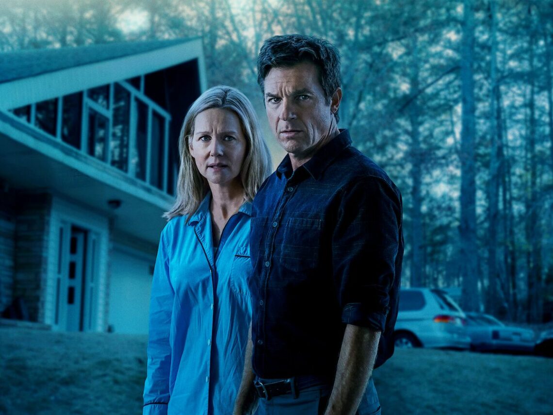
The misadventures of Jason Bateman’s Marty Byrde and the rest of his family kept viewers captivated and perched precariously on the edge of their seats during a four-season and 44 episode run between 2017 and 2022, with the clan’s descent further and further into the bowels of the criminal lifestyle they promised they’d make their way out of hardly going according to plan.
With one Golden Globe win from nine nominations and a quartet of Primetime Emmy victories from 45 nods, Ozark was a regular contender in the biggest categories during awards season. Sure, Julia Garner may have won four of those five prizes for her star-making turn as Ruth Langmore, but the show was always in the running for top honours.
Premiering during a time when the ‘skip intro’ option was unavailable, star and executive producer Bateman sympathised with audiences who’d long since grown weary of having to sit through the opening credits of a series they were already more than familiar with, so he came up with an ingenious solution.
“Don’t you hate a minute and a half of credits for a show you watch all the time?,” he rhetorically asked Jimmy Fallon. “It’s like, let’s get to the story.” To achieve that, Bateman enlisted graphic artist and regular David Fincher collaborator Neil Kellerhouse to come up with something short, sweet, simple, and stark that would set Ozark apart from the crowded pack.
“I didn’t want to do like a credits sequence,” the actor admitted. “I wanted to do something that was five seconds long.” As a result, Ozark settled on the white ‘O’ that appears against a simple black backdrop, with the four images contained within all dropping hints and clues about what’s to come in the episode unfolding right in front of the viewer’s eyes.
However, what goes more unmentioned is that moving clockwise from the top left to bottom right, the quartet of images loosely resemble the letters Z, A, R, and K, ensuring that in at least a vague fashion, the title of the show is displayed during its brief-yet-memorable introduction.
It was born from Bateman’s desire to forego extensive introductory credits, and it soon became a key part of the Ozark experience. Plenty of folks paused the sequence to see if they could figure out what was coming, and while the design team didn’t bend over backwards for slavish recreations of the alphabet, it went over many heads that ‘Ozark’ was displayed prominently and in full on every occasion.